
However, there are a few things that are annoying me (and if anyone knows me .. they know that its all these little things that REALLY annoy me).
[UPDATE - Please also see comparison post : 10 things I love about Windows 8 :)]
I know .. I know .. this is a release PREVIEW so it is really still in beta and a lot of things can change .. but there are some obvious flaws coming to the surface here, so without further ado, my list of..
Windows 8 (Release Preview) Pet Peeves
#1 Metro and the Taskbar
Now .. I have to admit I'm quite a fan of Metro. I have a Windows Phone 7.5 device (Nokia Lumia 800) and the metro interface is a very vibrant, quick, easy and (above all else) FUNCTIONAL interface.However, there are some major annoyances that I'm finding impact on my day to day work, and the main one is that Metro Apps don't appear in the Desktop Taskbar.
Now .. this might not be as bad as you think, but I spend a LOT of my working day in the Desktop mode (and therefore I have a lot of shortcuts pinned to the task bar) and like to use it for quick unobtrusive productivity notifications such as;
- You've had some emails
- Someone has started/posted to an instant chat
- Your file has downloaded
- Your application needs to tell you about something (i.e. it is flashing)
However .. a lot of default functionality runs as "Metro Apps" and the problem with Metro Apps is that they don't run in the task bar. They go full-screen and you lose all of that notification information I described above... so far these apps include:
- Mail (i.e. Email .. which is exactly why I don't use it and instead use Outlook 2010)
- Windows Reader (especially for PDF documents!)
- Video
- Music (although this will admittedly run in the background)
#2 How the hell do you "close" a Metro App?
Yes yes .. I know .. you aren't SUPPOSED to close them. The beauty of a Metro App is that it saves it's state and consumes 0% CPU while it isn't active onscreen (with a few exceptions .. such as music).This is based on the model used for Windows Phone 7 where you don't really need "multi-threaded" apps because for most productivity apps they aren't doing anything if they aren't in focus.
However ... the biggest problem is that they appear in the Alt-TAB "App Switching" dialog...
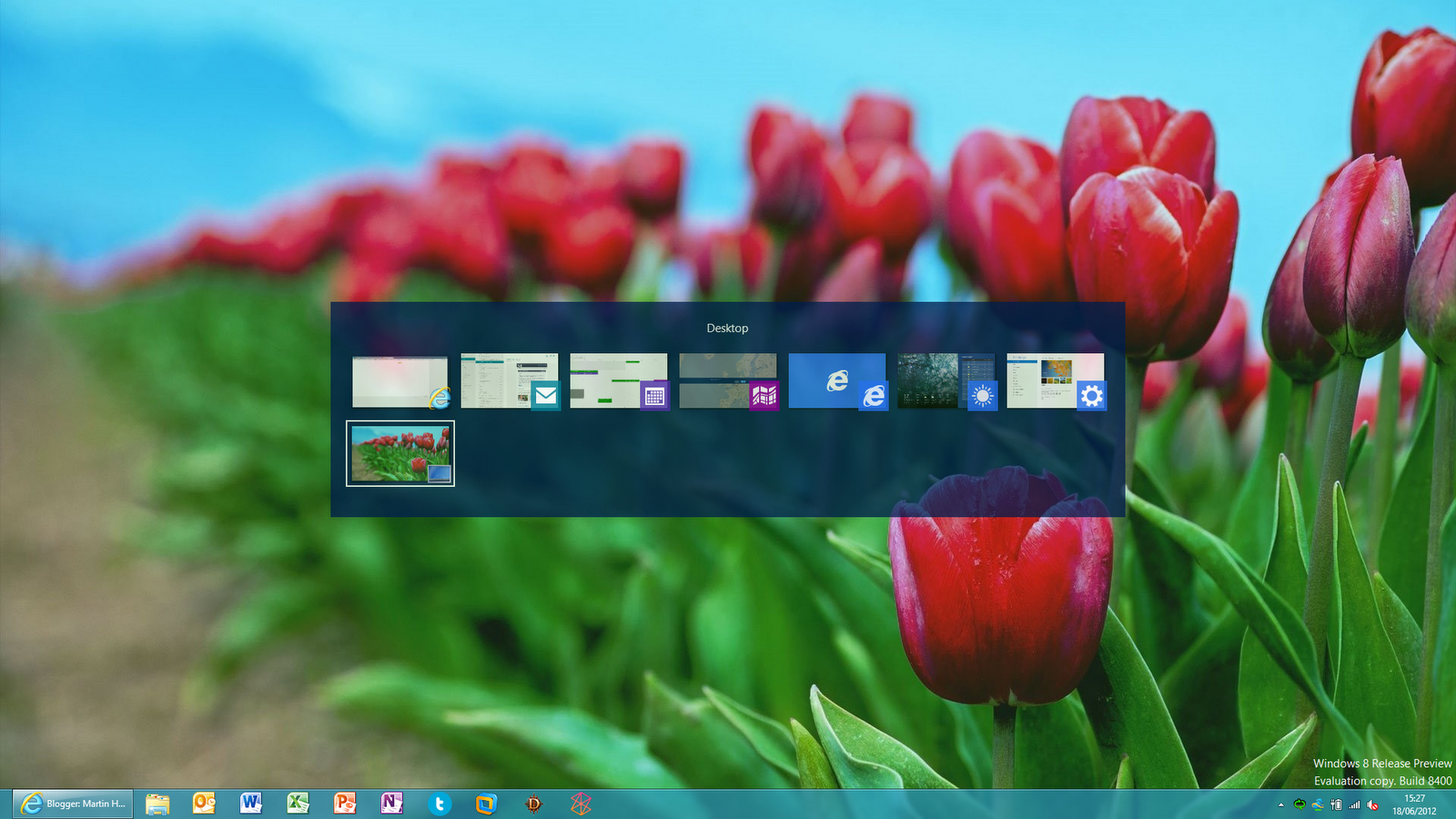
In the screenshot above the Taskbar shows one program running (IE10) but there are a whole bunch of Metro Apps running in the background (including another IE10 instance in Metro)
This is going to confuse the shit out of end users ..Now admittedly I'm thinking of my dad and my sister here.. but when you combine this fact with the apparent inability to CLOSE a Metro App ?? and you have a bit of a problem (especially with the "always on" mentality of the modern Tablet / Ultra-book device that never gets rebooted).
You can actually close them fine using the old Windows shortcut keys Alt-F4 but what percentage of the average user base knows this? (outside of developers, IT admins, tech geeks and power users??) .. I'm guess under 20% ..
#3 Move my mouse where??
Ok .. the removal of the Start Menu I could kind of stomach. I get where they are going with this and I know they want to get everyone using the new interface ... but they REALLY need to put a tutorial in this for their commercial release..The "gestures" (for want of a better word) for the main operational menus (as far as I can tell) are as follows:
- Bottom-Left Corner, Left Click - Start Screen (yes .. the Metro one)
- Bottom-Left Corner, Right Click - System Tools (for want of a better word .. access to Control Panel, Computer Management and such)
- Bottom-Left Corner, move cursor up - App Switching Panel
- Top-Left Corner, Left Click - cycle through currently running apps
- Top-Left Corner, move cursor down - App Switching Panel
- Top-Right Corner, move cursor down - "Charm Bar" (access to Search, Share, Start, Devices and Settings)
- Bottom-Right Corner, move cursor up - "Charms Bar"
- Bottom-Right Corner of Desktop View - Show Desktop button (which still works .. if the Charms Bar doesn't get in the way)
- Top-Left Corner - File Menu (when the app-switching button doesn't get in the way)
- Top-Right Corner - Close / Minimise buttons (when the Charms bar doesn't get in the way)
How the hell am I supposed to know this ??I've also got some screenshots to show you what some of this looks like..
First you move the mouse cursor bottom-left and the small slightly nasty looking "Start Screen" graphic appears (yes .. the fact that it shows the size and location of your ACTUAL pinned apps is kinda cool .. but it still looks like a Tetris puzzle from the 90's!)


Then move cursor down a bit (or up) and the actual charms bar pins in for interactivity ..

The actual experience (once you've worked out what you are doing) is ok (and I'm sure in 5 years time I'll swear its the best part of the interface) .. but expecting people to just "get" this ??
I see a lot of people struggling (especially the less technically literate!)
#4 Metro - Settings, Options and Menus - Keeping you on your toes!
This is a bit of a wail and complaint about the new Metro App interface and how they deal with things like settings, options, menus and the like.
When Windows 3.1 came out they provided a standard way of providing menus (and pretty much every single application for the next 20 years was using the good old File, Edit, View, Tools, Help menu bar). Didn't really matter what you were using .. you knew where to look and generally where you would find it (apart from idiots who put Options / Preferences under the "Edit" menu).
However in Metro the interface seems to be a bit all over the place. You never really know where you are supposed to be looking, or how you are supposed to get there.
My new expectation is that if you right-click you get the menu bar popping up (NO idea how you'd do this with a touch-screen device .. if someone wants to tell me?)
Examples:
- Start Screen - Bottom Right
- IE10 - All 4 corners (although click on "Add Tab" in the top panel .. new option panel for pages appears ... at the bottom !!)
- Weather - Top Left, Bottom Left and Bottom Right
- Mail - Bottom Right
- Maps - Bottom Right
- Windows Store - Top Left
- Photos - Bottom Right
- SkyDrive - Bottom Right
- Calendar - Bottom Left and Bottom Right
- Video - Bottom Right
- News - Top Left
- Sport - Top Left
- Wikipedia (3rd Party App) - Bottom Left
I hope you can appreciate I don't really know where to expect to find things .. and my eye is constantly switching from top to bottom, left to right. To make this worse I can see 3rd party apps using different icons for the same thing ... or the potential for worse .. the same icon for something else!! (I can see this getting MUCH MUCH worse as the Windows Store starts filling up).
Does this make it "unusable"?? not at all .. I just find it annoying.
I'm hoping that once the commercial version comes out there is some form of "standard" for layout of options and menus. I think part of the problem is that the "touch screen" friendly interface means you don't have very much room, which is why IE10 (one of the most functional "toolbar heavy" apps you'd want to use on a touchscreen device) has to resort to using all 4 corners of the screen.
#5 Metro .. or Desktop .. ?
This is my final frustration, and I've already found probably 3 major apps which I use every single day .. but can't see myself ever really using the Metro App versions;
- Web Browser
- E-Mail
- Twitter / Social
And this harks back to the problems with the Task Bar (Pet Peeve #1 and not being able to close them, Pet Peeve #2).
The problem is this:
- Only Metro Apps will post statuses to the Lock Screen (like Music / Messaging / Weather / Email .. very very similar to Windows Phone 7 experience!)
- Only Metro Apps support Live Tiles
However (as previously discussed)
- Metro Apps always run full screen
- Metro Apps are "touch" oriented and feel clunky with keyboard & mouse
- Metro Apps don't appear in the Task Bar!
So I've found myself configuring a Metro App like Mail (to get Live Tile / Lock Screen) but never actually running it! I just jump over to the Desktop and fire up Outlook instead (although I've very keen to see what the next "Metro" version of Outlook is like!)
But certainly my biggest issue is the separation between Metro and Desktop
I have basically replicated my Start Screen in the Task BarThis just feels plain wrong .. why am I doing this twice? I never really felt the need to do this before (because the Desktop was everything, and the Start Menu was just a place to store the shortcuts for things "I use but not very often") but now I almost feel like I have two computers.
To make things worse you can't set an easy "default" app either for both environments. If you are in the Metro interface and click on a URL it will open the Metro Web Browser. It doesn't prompt you, and I can't work out how to override this to go to Desktop either.
Why is this important?? Well .. the Metro app doesn't have the same favourites as the desktop app! (yep .. they are as far as I can tell completely independent!)
And I can see the same kinds of things happening. If I click "New Mail" is it going to force me to use the Metro "Mail" app or can I have it auto-prompt to the desktop "Outlook" instead? And if so .. how would I configure this?
Summary ...
I think at the end of the day I can sum up my Pet Peeves on Windows 8 with this:Desktop WorkstationMy laptop is basically a desktop workstation. I want to use Desktop mode .. all the time. Do I like the some of the new features of Windows 8 ??? hell yes.. the new Security features, system recovery, awesome boot times, new task manager, windows explorer functions, ISO mounting and Hyper-V integration are almost worth the upgrade alone!
Do I like some of the new Metro Features?? Hell yes .... I love the Live Tiles .. I love the lock-screen updates and the interface is pretty neat and slick ... Will I actually use any Metro Applications?? No ... I will avoid them like the plague (for reasons well stated here).
My parting shot ... I am a Microsoft guy through and through. If you cut me in half it probably says "Windows" in there somewhere (and definitely says "SharePoint") and these are peeves I am prepared to live with .. but will everyone else? I see a lot of new users struggling (a LOT) and I can see businesses very rapidly choosing to NOT deploy this.
I really hope Windows 8 is a success and I don't think it will bomb like Windows Vista did (this doesn't have any of the performance / compatibility issues that Vista did) .. but with some of these niggling things I think it might be a bit of a damp squib.
You can close a Metro app with the stunningly obvious steps:
ReplyDelete1) Click on the top / middle portion of the screen.
2) Drag the window down.
On a touch screen that makes sense, but I agree, with no touch it is just wierd.
Ahhh .. cheers Ben :)
ReplyDeleteI'll add that to the list of "gestures that cannot be performed through menus, with no form of obvious help or tutorial"
I really can't see people "knowing" to do this ..
ALT-F4 works too man. Go Old Skool
ReplyDeleteI'm 100% with you. Windows 8 sucks without touch, keyboard and mouse you are guessing completely. I still think even with touch you are guessing to find certain things. I think they need like a quick 5 minute video when you first use as its not intuitive at all! once you know, you know...well for smart users...I can see a lot of people forgetting and getting frustrated though.
Anyone checked to see if some GPOs exist to put the start menu in a "classic" windows 7 mode perhaps? Haven't have the time but trying to imagine how this would work inside the enterprise without any touch screens for the next 7 years
ReplyDeleteBenjamin,
ReplyDeleteThe "Force Classic Start Menu" group policy has no effect.
There used to be a registry tweak to re-enable the start menu but that doesn't work either.
I think MSFT know that if a "use my old settings" option exists then no-one will actually use the new interface
Hi Martin, I think this is a really good article and worth a read for anyone thinking of getting Windows 8 and those thinking of developing Metro Apps (like myself). I had a go with Windows 8 and quickly got frustrated and ended up back in desktop mode.
ReplyDeleteLets wait and see about the amount of tutorials on how to use Windows 8, it is still early days yet and maybe this knowledge will be widely known by the release date which I think is October time?